Client brief
Squared is a UK-based security services company. They needed a logo that could be used across letterheads, business cards, a website, and future mobile products.

Logo Designer
Designed a clean, modern security brand logo with a subtle keyhole concept, created to work across print, web, and future mobile use.
This project did not have a public live site. Screens and design decisions are documented below.
Squared is a UK-based security services company. They needed a logo that could be used across letterheads, business cards, a website, and future mobile products.
As a growing company, they needed a professional brand identity they could confidently put on everything they publish.
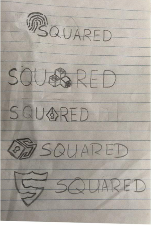
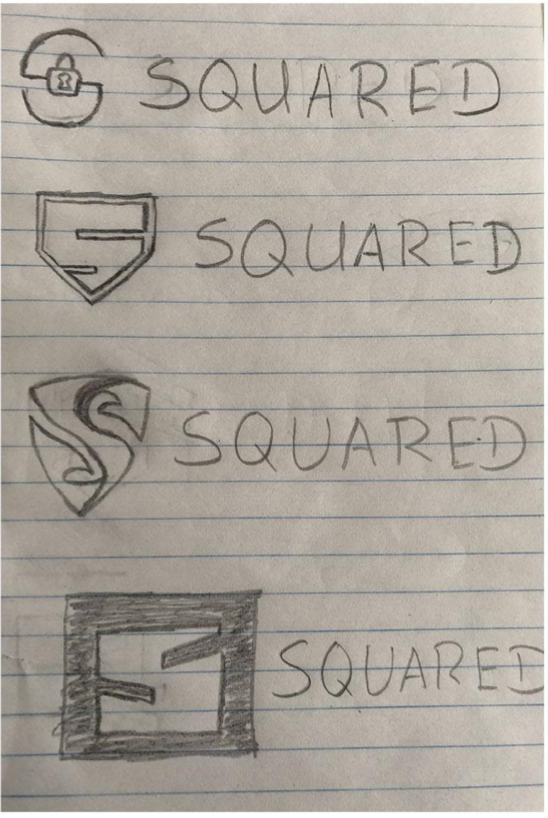
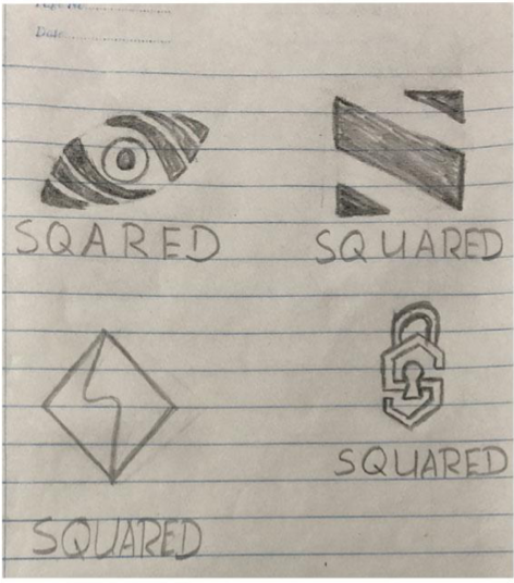
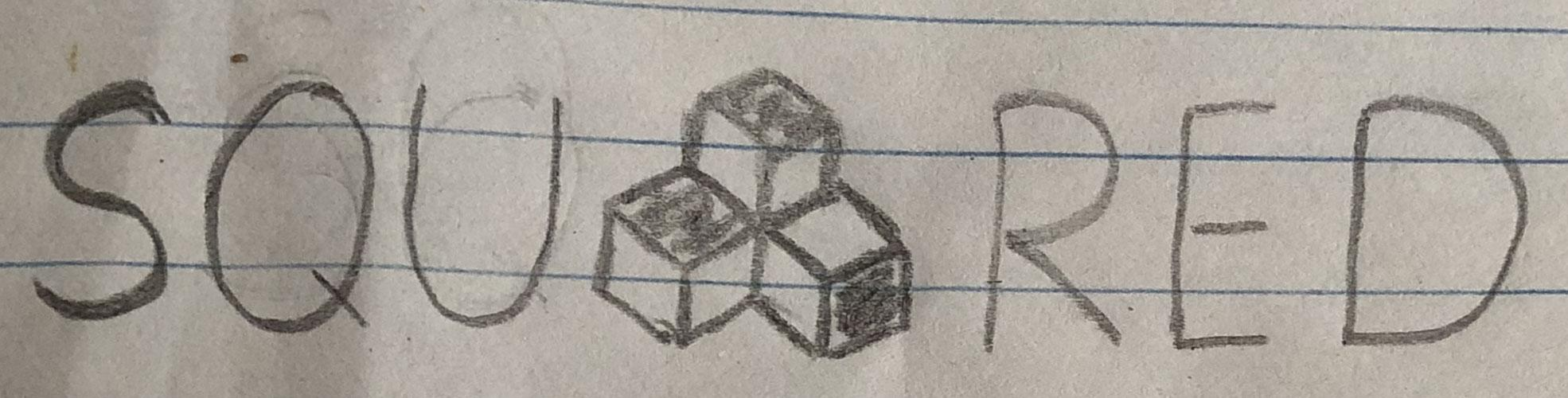
I started by exploring what “security” should visually communicate, then moved through sketching, shortlisting, and refinement until a final concept stood out.
I listed visual ideas connected to security (e.g., keyhole, lock, shield) and reviewed competitor styles to avoid creating something too similar.
After sketching several directions, I shortlisted the strongest ones with the Project Managers before presenting them.
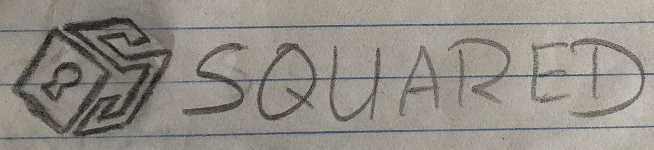
The final direction leaned into a clean typography-based mark. The letterform was refined to subtly resemble a keyhole while staying modern and easy to reproduce.