EcoPizza

UI Designer

Client brief

EcoPizza is an Italian pizzeria established in 1993. Located in the city of Milan, EcoPizza is an establishment that caught the hearts of many tourists to the country with their amazing pizzas.

Problem statement

The lack of a mobile application blocking EcoPizza from reaching new potential customers.

Product scope

We were a small team consisting of a Product Owner, a few iOS and Android Developers and myself playing the UI Designer role.

The duration provided to us was a total of 3 months, both, for designing the mobile user interfaces and developing the mobile application for both iOS and Android platforms.

Process

Since our client provided us with the problem they were facing and had done up the initial sketches for the application, my duty involved transforming the sketches to high-fidelity designs.

We hopped on a call as a team before we began designing, to go through the requirements thoroughly.

After the call, I immediately started analysing our client's logo to decide on the colours to be used. I decided to use the "Green" from our client's logo as the primary colour, as it more closely reflected on the "Eco" theme.

initial register screen initial main menu screen initial product menu screen initial product customization screen

After presenting the initial designs to our client, they pointed out that using the "Magenta" from their logo would be best suited as the primary colour as it makes the design more prominent compared to the "Green" which I used in my initial designs.

Apart from the minor colour change, our client presented a few new requirements and modifications;

  • allowing the user to register themselves as an individual or an organisation
  • providing the ability to increase the count of the product in the customization page
  • enabling the ability to provide additional notes (i.e. provide more napkins)
  • allowing a single user to place multiple orders to multiple addresses
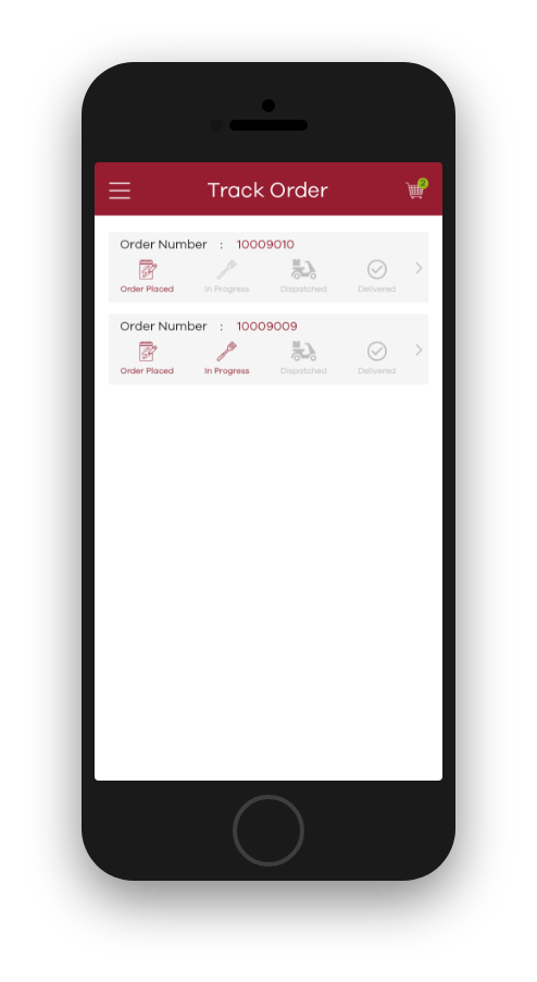
  • ability for the user to track their orders

With the feedback received, I got back to designing the second iteration of high-fidelity designs.

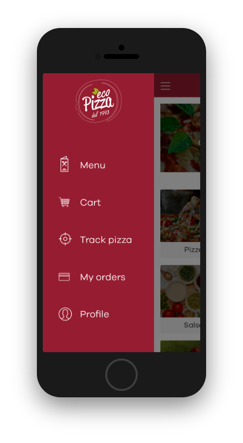
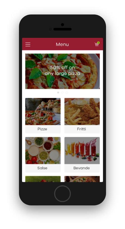
final side menu screen final register screen final main menu screen final product menu screen final second screen of product customization final order tracking screen

Outcome

As a team, we were proud to have worked with our client, EcoPizza and help them achieve their goal of gaining more reach by hopping on the trend of going mobile.

Our client was pleased and very thankful that we delivered on our promise in under the agreed duration of this project, despite the additional requirements that came in mid-way.

Potential improvement

  • Order numbers are hard to remember, so allowing the user to rename the order would help them identify each individual, among multiple orders placed by the same user, easily
nulllogo Previous
Squaredlogo Next